This post was last updated on July 9th, 2024 at 09:15 am.
We’ve made a lot of changes over the past couple of weeks in response to suggestions customers have posted in the support forum. We re-arranged and renamed many of the buttons to make both the Household and Individual Record forms more user-friendly. There are a few other additions as well. A few changes were also made to the Parishioner Security window.
In case you missed any of the announcements, here is a complete list of the enhancements:
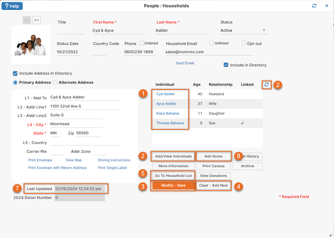
Household Form in the People: Households Window
- Clicking on a member’s name links directly to the individual’s record. This link will save you an extra step, instead of clicking on the ‘Add/View Individuals’ button and then selecting a name.
- ‘Add/View Individuals’ and ‘Refresh Members’ have been moved. The ‘Add/View Individuals’ now appear under the Family Members list. The refresh is now the circle with two arrows icon.
- The ‘Save’ button changes to ‘Modify-Save’ after the record has been initially saved.
- The ‘Clear’ button has been renamed ‘Clear – Add New’. This button clears the data and returns the screen to ‘Add Mode’. It will not automatically save the existing data on the form.
- The ‘Household List’ button will take you to the Household list.
- In ‘Add Mode’, non-applicable buttons are disabled (not pictured below.)
- A ‘Last updated’ date has been added so you can see when changes were last made to the household record.
- An ‘Add/View Notes’ button has been added so you can quickly access member notes window while looking at a record. If there is already a note it will say ‘Add/View Notes’.

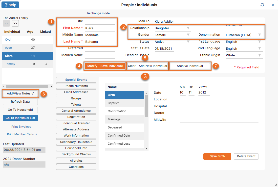
Individual Form in the People: Individuals Window
- ‘First Name’ and ‘Last Name’ are labeled as required fields.
- The default gender is now ‘Female’ so it matches the default relationship of ‘Daughter’. It used to say ‘Daughter’ and ‘Male’. The correct ‘Denomination’ should also be the default in the drop down.
- The ‘Modify-Save Individual’, ‘Clear-Add New Individual’, and ‘Archive Individual’ buttons have moved to the middle of the screen.
- Just like the household screen, the initial ‘Save Member’ button will change to ‘Modify-Save Individual’ when modifying the record.
- The ‘Clear Fields’ button has been renamed ‘Clear-Add New Individual’.
- An ‘Add/View Notes’ button has been added so you can quickly access the individual notes window while looking at a record. If there is already a note it will say ‘Add/View Notes’ and display a checkmark.
- The “Delete” button was renamed “Archive Individual”.

Tools & Services: Member Portal Security Window
‘Status’ and ‘Assign Access’ drop-downs have been added to the Tools & Services: Member Portal Security screen. This enables you to quickly sort the list of names and assign access based on status codes.
Important: a household email address is now required in order to give a household access to the member portal.

Improvements are great – one extra that I think would be a time save is to add a button for Go To Household list on the member update page. After I finish an update, I don’t usually need to return to the Household page but rather to the Household List to find the next family for updating.
Thanks for the suggestion, Pat! It’s helpful to hear how our customers are using the system.
Good morning: Would you please direct me to more information about archiving. Thanks, Anita
Anita, please refer to post # 4 How do I handle deceased individuals? and post # 1523 People: Members: Archives in the support forum for information on archiving members. If you have any other questions on that, please let us know!
Hi: I appreciate the referenves to the ‘posts’, but where do I find them? Anita
I apologize for not being clear. The posts are located in the support forum. To access them:
When you are logged into IconCMO, go to the Help menu located in the top right corner. In that list is a link that says ‘Visit our support forum.’ Once you are in the support forum, just type a post number into the search box and hit the ‘Enter’ key on your keyboard.
Hope this helps!
Thanks for trying to make CMO better. Keep up the good work of making CMO easier to operate
Thanks, Vaughn – you are more than welcome!
Those are all excellent changes. Thank you for working so hard to improve IconCMO and to remain so responsive to your customers’ needs.
Thanks, Chris! Glad to hear you are liking the new changes =)